In 1964, the Olympics began representing events in the Games through a set of intentional figures. Each event had its own pictogram, used all across the Olympics for promotion. These pictograms remain a significant part of how the Games communication. They are used on venue maps, programs and building walls, and as a result, they’re impossible to miss.
As an international event, communication and language barriers are almost unavoidable. By using pictograms to represent each event, no matter a persons native tongue, that barrier breaks down. This year, the International Olympic Committee released a historical overview of the pictograms for the last fourteen Olympics.

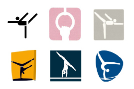
Tokyo 1964
Graphic Designers: Yoshiro Yamashita / Masaru Katzumie
Creative Context: The need to develop visual communication capable of effectively informing the participants and spectators of an ever-increasing number of nationalities at the Games was of particular importance for the Organizing Committee of the Games (OCOG) in Tokyo. Symbols in simple and schematic shapes solved this problem. Limited graphical elements created the silhouettes of an athlete’s body in action.

Mexico City 1968
Graphic Designers: Urban Design Department of the Organizing Committee of the Games of the XIX Olympiad, including Lance Wyman
Creative Context: The Mexico City 1968 pictograms use only part of the athlete’s body or equipment. This is the principle of representing the whole by a part. These pictograms make reference to Mexican culture and history, since pre-Hispanic glyphs served as the basis of inspiration. The design of the water used for the aquatic disciplines and sailing recalls the parallel lines was inspired by the art of Huichol Indians. The emblem and visual identity of this Games edition also use this.

Munich 1972
Graphic Designers: Otl Aicher
Creative Context: In the lineage of those from Tokyo 1964, the Munich 1972 pictograms present silhouettes in typical sports poses. A system of graphic and geometric rules sets them apart.
A checkered square serves as a reference for their development. The lines of the pictograms are constructed based on angles of 45° or 90°. The style developed for this set is a milestone both in terms of the design of Olympic pictograms and pictograms in general. In addition, the way some sports are represented influenced the sets of pictograms for later editions.

Montreal 1976
Graphic Designers: Otl Aicher, adapted by Georges Huel and Pierre-Yves Pelletier
Creative Context: The OCOG in Montreal decided to use the Munich 1972 pictograms to ensure continuity of the symbols. Modifications were made to some pictograms. For sports, a change is mostly visible in case of the judo where the character was shown executing a different pose.

Moscow 1980
Graphic Designers: Nikolai Belkov
Creative Context: The OCOG in Moscow approached several art schools to include the theme of the Olympic pictograms in the students’ degree projects. It was the work of Nikolai Belkov, a graduate of the Mukhina Arts School in Leningrad, which was chosen. The lines that are constructed on 30° and 60° angles aim to give an impression of suppleness to the image. Finally, the silhouette angles are rounded off and the body is one piece, with the exception of the head.

Los Angeles 1984
Graphic Designers: Keith Bright and Associates
Creative Context: The OCOG in Los Angeles was first interested in obtaining the rights to the Munich Games pictograms, but realized that creating new pictograms was more economical. It launched a contest between three Californian companies to create the designs.
First of all, six essential criteria were defined for developing the pictograms: clear communication, consistency, legibility and practicality, flexibility, design distinction, and compatibility with the look of the Games. In addition, the designers studied several options: the use of partial figures, realistic silhouettes or the addition of lines illustrating speed. Finally, opting for simplicity, they created a schematic silhouette formed of ten parts. A circle for the head, an oval for the trunk and eight parts which form the arms and legs.

Seoul 1988
Graphic Designers: Seoul Organizing Committee
Creative Context: In 1985, a set of sports pictograms was created to be used at the Asian Games in 1986 and the Olympic Summer Games in 1988, both held in Seoul. However, wanting to have a unique image for the Olympic Games, the OCOG decided to create a new set of pictograms for the Summer Olympics. The head, the trunk, the arms and the legs make up the four pictogram parts. The white trunk contrasts with the other elements of the body.

Barcelona 1992
Graphic Designers: Josep Maria Trias
Creative Context: For these pictograms, the accent was placed on the artistic aspect as well as the analogy with the Games emblem. Like the character of the emblem, they are made up of lines that recall those of a brush stroke and are formed in three parts: the head, the arms and the legs. The trunk is never represented but it is suggested by the other elements. Finally, the pictograms and emblem aim to transmit a dynamic, open and human movement.

Atlanta 1996
Graphic Designers: Malcom Grear
Creative Context: Figures found on Ancient Greek amphorae inspired these pictograms. Their classic design established a link with the ancient origins of the Olympic Games. The style of the silhouettes aims to be realistic and close to the human form. As a result, the silhouettes exhibit a striking, clearly marked muscle structure. Sailing and the modern pentathlon broke the mold of stylization that had been in place since Munich 1972.

Sydney 2000
Graphic Designers: Saunders Design
Creative Context: Boomerangs make up the pictogram silhouettes, generally one for the legs and two small ones for the arms, just like the character of the Games emblem. The use of boomerangs, traditional hunting tools, pays homage to Australian Aboriginal culture. The pictogram style aims to be dynamic to recall the speed and agility of the athlete.

Athens 2004
Graphic Designers: ATHOC 2004 Image & Identity Department
Creative Context: Ancient Greece inspired the Athens pictograms. Through their plain and uncluttered shapes and simple layouts, they make reference to Cycladic figurines. The silhouette of the athlete and the fine strokes which define the details recall the black-figure vases of Ancient Greece. Finally, the fragments of ancient vases served as inspiration for the irregular shape of the pictogram frames.

Beijing 2008
Graphic Designers: China Central Academy of Fine Arts / Academy of Arts and Design, Tsinghua University
Creative Context: The OCOG in Beijing called on four graphic arts institutes to submit projects. A working group uniting the two chosen institutions perfected and finalized the project.
Incorporating mainly the notions of aesthetics and movement, the pictograms make reference to Chinese culture through several aspects. The seal-script characters of Ancient Chinese calligraphy serve as the basic structure. In addition, this writing gives a rounded and smooth aspect to the pictograms. The set name, “The Beauty of Seal Characters”, refers to this calligraphic style.
Inscriptions on bone and bronze from Ancient China adapted in a modern and simplified style also inspired the pictograms. Finally, they recall the traditional Chinese art of rubbing, through the marked contrast between the colors.

London 2012
Graphic Designers: SomeOne Design Agency
Creative Context: The London 2012 Olympics had two types of pictograms. The standard one followed the silhouetted style of its predecessors. The London Underground inspired the alternative, the dynamic version. The pictograms were designed for a variety of uses, including digital and 3D applications. The style from Mexico City 1968 was also reintroduced, featuring a variety of disciplines in the modern pentathlon pictogram.

Rio 2016
Graphic Designers: Rio 2016 Organizing Committee for the Olympic and Paralympic Game
Creative Context: The OCOG in Rio put a team of graphic designers in place internally to produce the pictograms. The official typography of Rio 2016 creates the silhouettes of the athletes. This typography is itself inspired by the Games emblem and the curves of the carioca landscape. The fluidity of the lines aims to simulate the movement of athletes in action. In addition, a continuous line which varies in thickness to give an impression of depth, forms each pictogram. The frame of the pictograms, in the shape of a pebble, adapts to the silhouettes and strengthens the movement of the athletes.
All of this information is sourced from the International Olympic Committee, and is available for download here.