My first job out of college I got hired as a typesetter for a sign company. I was set up with a creaky Linotype computer. On the wall a poster hung displaying the dozens of fonts I could print onto a roll of film. (That roll of film would then be sliced — old school style — and pasted onto boards by a trio of production artists in the next room.) My boss was a strict taskmaster about line spacing and kerning. Type should be clean and easy to read, and most definitely Swiss. (I think he had more affection for Helvetica 55 than his own grandchildren.) I also remember the ire in his voice when one of our clients switched their branding from the sturdy Clarendon to the comparative spindly ITC Garamond, proving the simple act of a company changing their logo font can provoke a strong, and not always positive reaction. Alas, times were changing. A few months later, my Linotype computer was replaced with a Mac, the production artists with Adobe Illustrator. Not long after my boss retired, and soon I moved on too. I wanted to be a designer, not a typesetter. But my interest for typography endures, and I’m grateful for that job for giving me a healthy respect and love for the power of fonts.
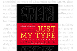
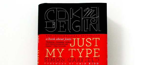
Which is why I found Just My Type, Simon Garfield’s 341-page treatise on fonts, such a joy to read. It helps the writing is breezy and light, but offers enough details to inform and savor. Sure, there is history to cover, and Garfield does his research: the invention of the printing press, the rise of digital typesetting. I also now know what a punch and a strike are, that there are real people behind the names that populate my drop down menu (Baskerville, Caslon, Zapf…), that rub-off Letraset type helped influence the punk aesthetic of the 70s. Do-it-yourself design before the ultimate do-it-yourself tool, the home computer, arrived and changed everything. There is a surprisingly interesting chapter on the team who standardized roadway signage in England, but there is dishy stuff too: Did you know that Eric Gill, designer of the always reliable Gill Sans probably had incestuous relations with his daughter (and dog!)? That Vincent Connare, designer of the oft-reviled Comic Sans, is actually a modest and thoughtful man. Really, is it that terrible of a font? And that Barak Obama might have won the Presidency because of Gotham.
A few days ago I was helping my son put together his science fair presentation. He experimented on growing crystals, and we had the requisite PowerPoint charts and phone snapshots printed out on letter-sized paper, but we needed something to tie the look together. Then my son spoke up. He found the perfect font online. Step aside from the fact that my eleven-year-old son even knows what fonts are. He had the wherewithal to seek them out. These days there is a font for everything, and there is a font called Crystalline with cartoonish crystal-like facets on its face. And even better, it was free. It’s a font-crazy world out there, and it’s amazing.
Just My Type: A Book on Fonts by Simon Garfield is published by Gotham Books.